Cultivating a Better Navigation Experience for Soy Farmers
UX Designer (Me)
Product Manager
UX Researcher
UX audit
Usability testing
Hi-fi prototypes
End-to-end redesign
Context
As a UX designer at OBP Agency, I was tasked to breathe new life into USB's outdated website.
They were noticing a decline in active users on their website and wanted to pin-point the reasons.
“ How might we enhance the user experience on the USB's website? ”
Results
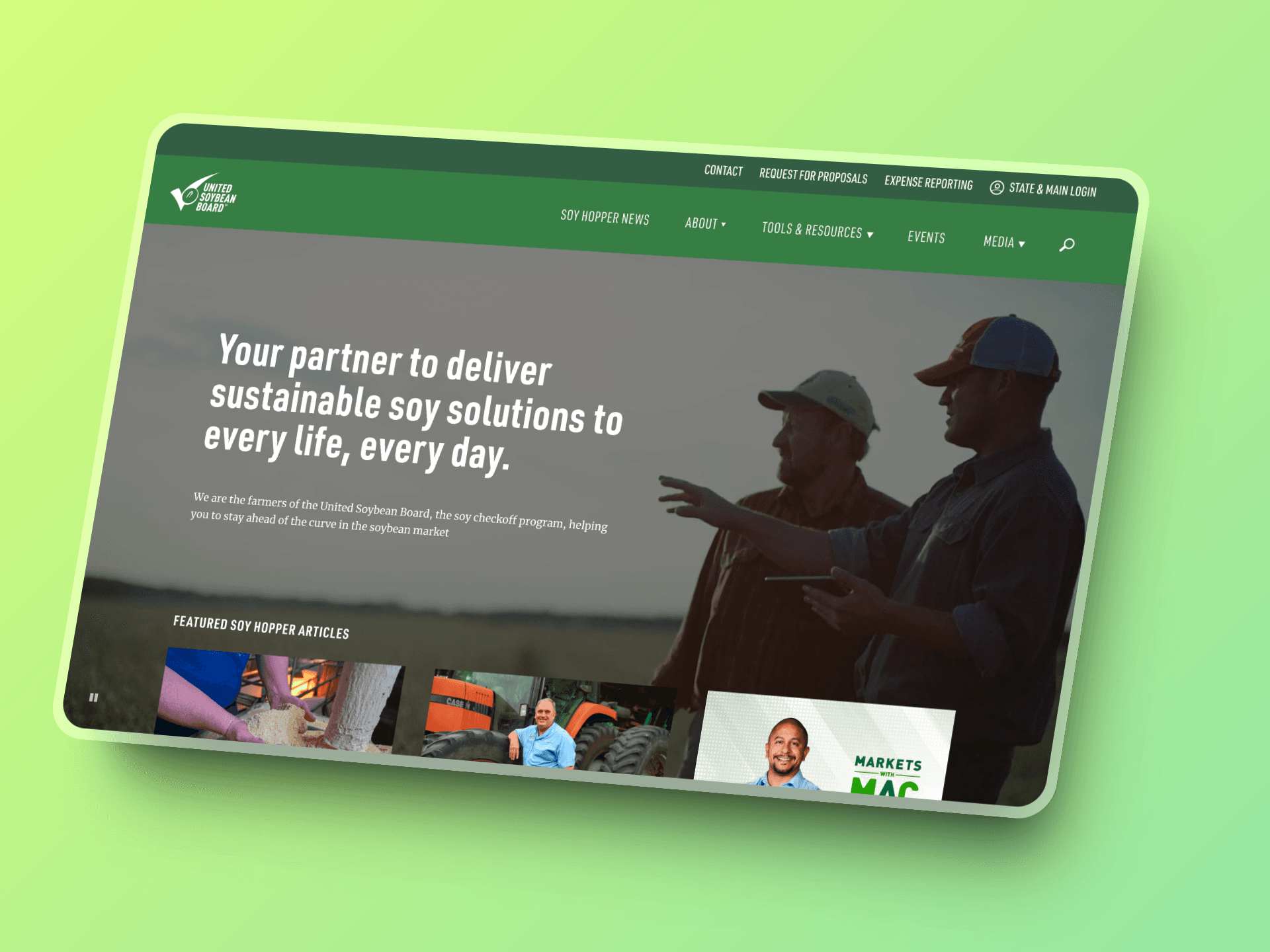
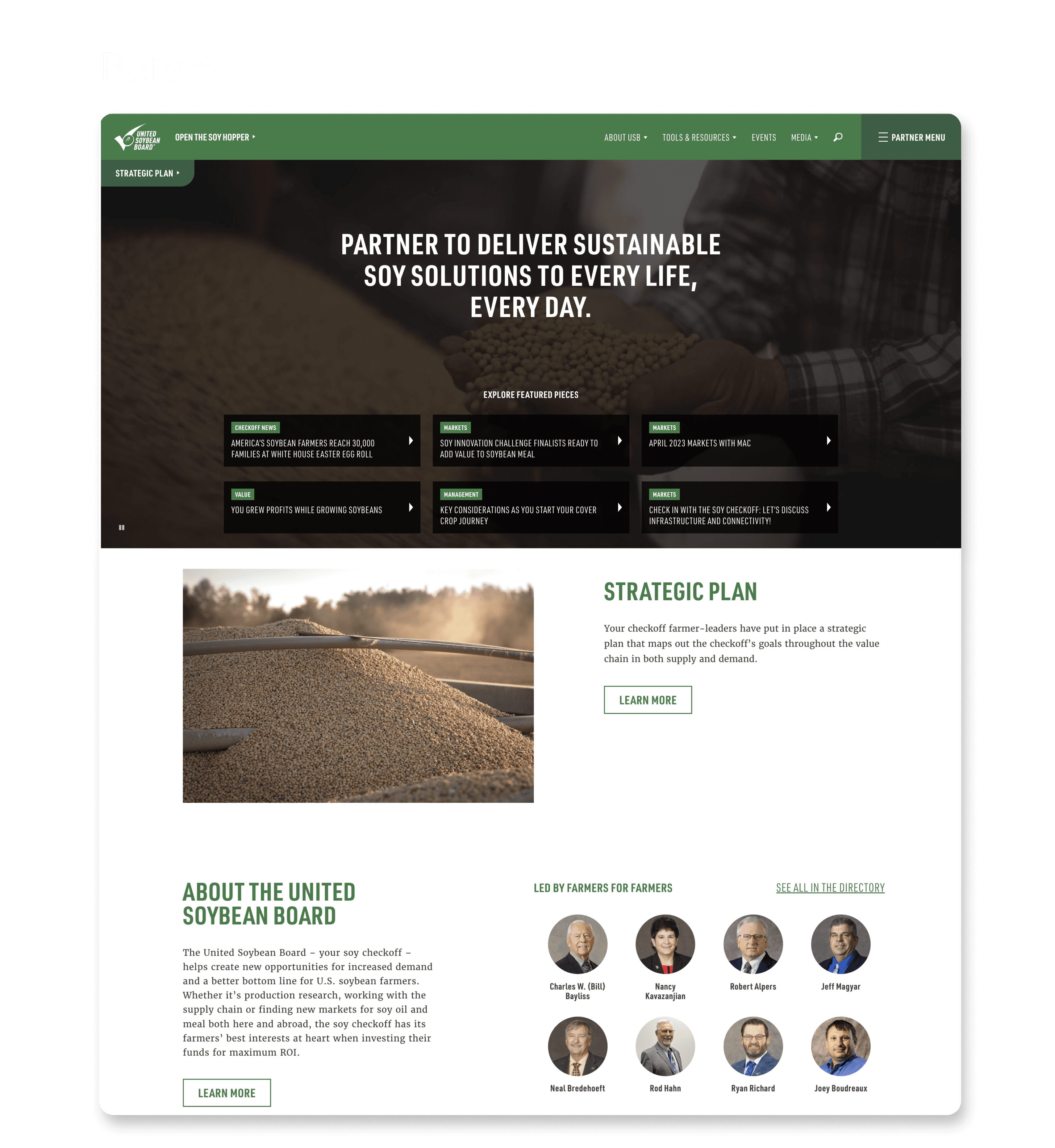
The redesigned website simplifies navigation, improves key page access, and adds personalization to boost engagement and retention.
25%
↑ in task completion efficiency
95%
Recommendations approved
84
System usability score - A rating
You must be wondering - What's USB?
I was thinking the same in my first team meeting
USB is

Think of them as → Managers of soybeans in 🇺🇸
Manages → Soy research, supply chain, and market
Collect → funds from soy farmers and investors
And help farmers → in research, news and promotion
Process
Understanding the Users
For this project, we focused on the primary users.
Primary Users

Farmer Investors
Farmers affected by USB's initiatives
Not very tech-savvy

New Farmers
New members of the soy industry
Wants to know about USB
Secondary Users
Media, USB Partners and Staff
What was the current user journey like?
The user navigates to the USB website, typically to perform a task. Common user goals like:
Checking market trends and pricing
Accessing articles and educational resources
Finding industry news and updates
Locating information about USB programs and initiatives
Submitting or accessing forms and documents
From the homepage, the user browses through the main navigation menu or uses the search bar to find their desired information.
Once in the relevant section, the user interacts with the available features:
Reading articles or viewing data
Watching videos or podcast content
Downloading documents
Filling out registration for newsletter
After completing their task or finding the needed information, the user either continues exploring other sections of the website or exits the site.
What were users saying?
“ It took me a long time to find the catalog ”
Jason Frerichs
Soy farmer investor
“ The structural information is usually under directory! ”

Rick Kimberley
New farmer
Unearthing the Root Issues ⛏️
UX Audit
Our users want to easily navigate to soyhopper catalog to get latest research and news relevant to them.
But what stands in between?
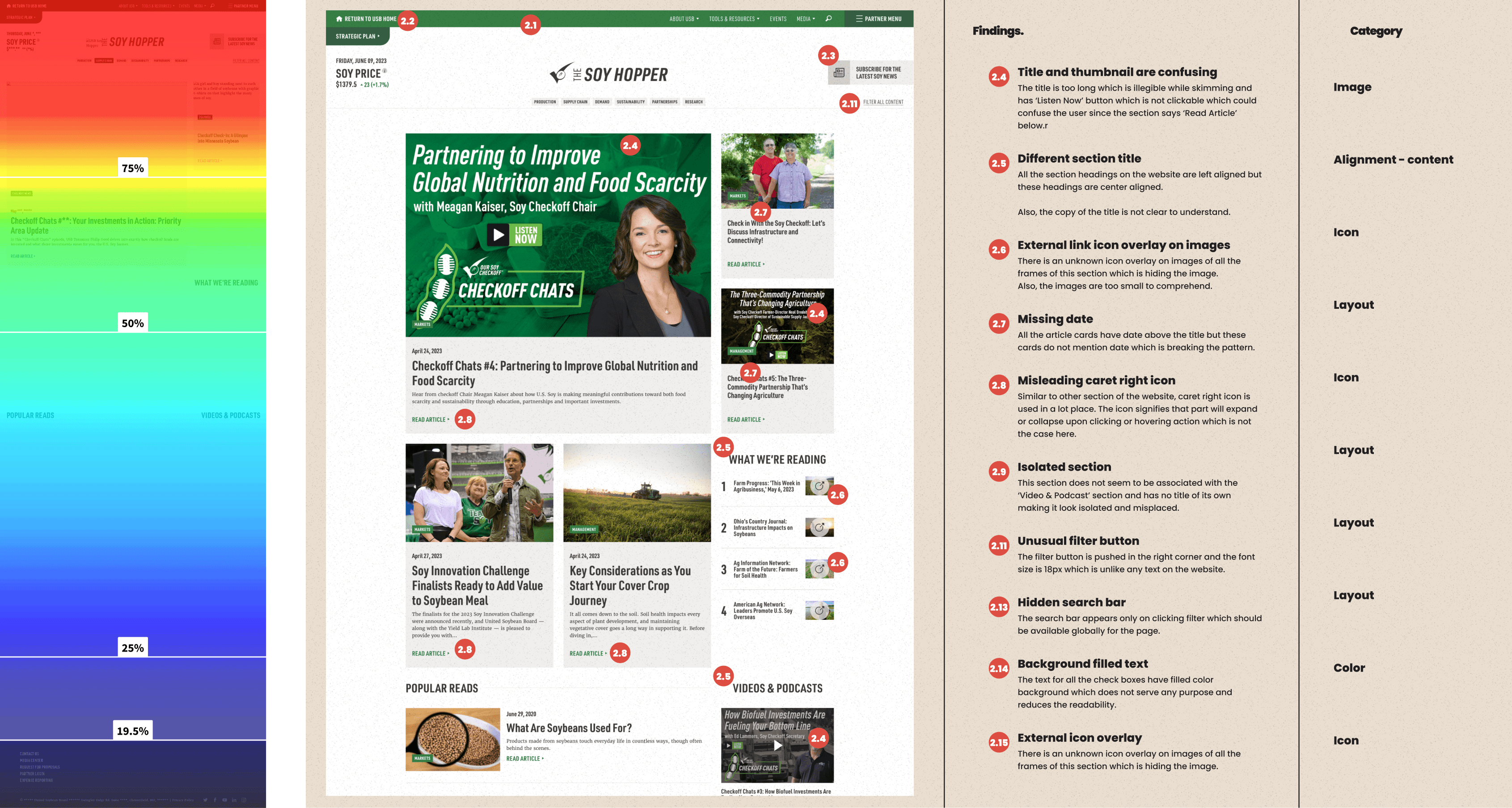
Purpose of the page: Provide a catalog of soy-related articles, videos, and podcasts.
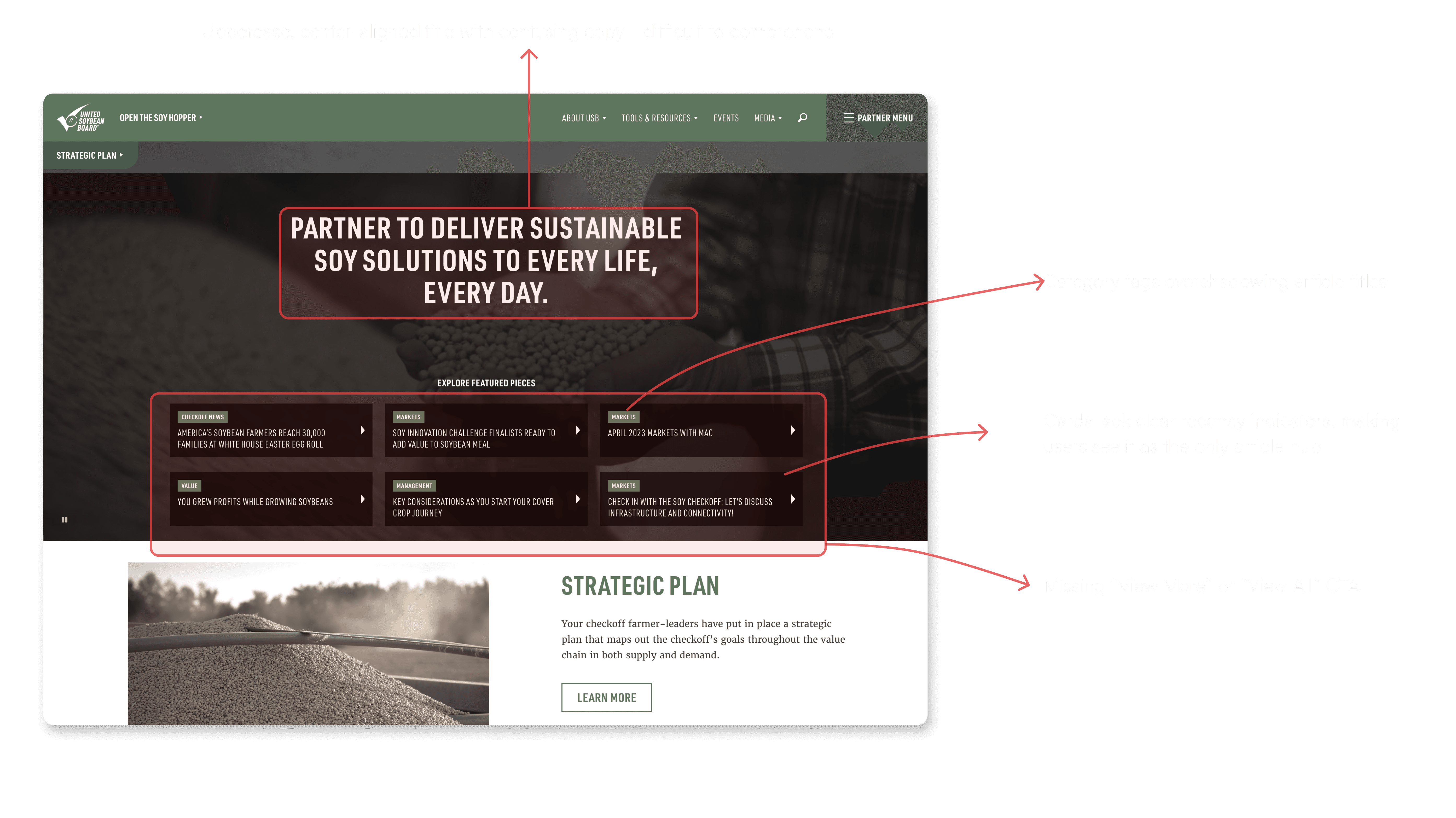
The hero section lacks clarity, price section is underutilized and outdated and a vague tagline.
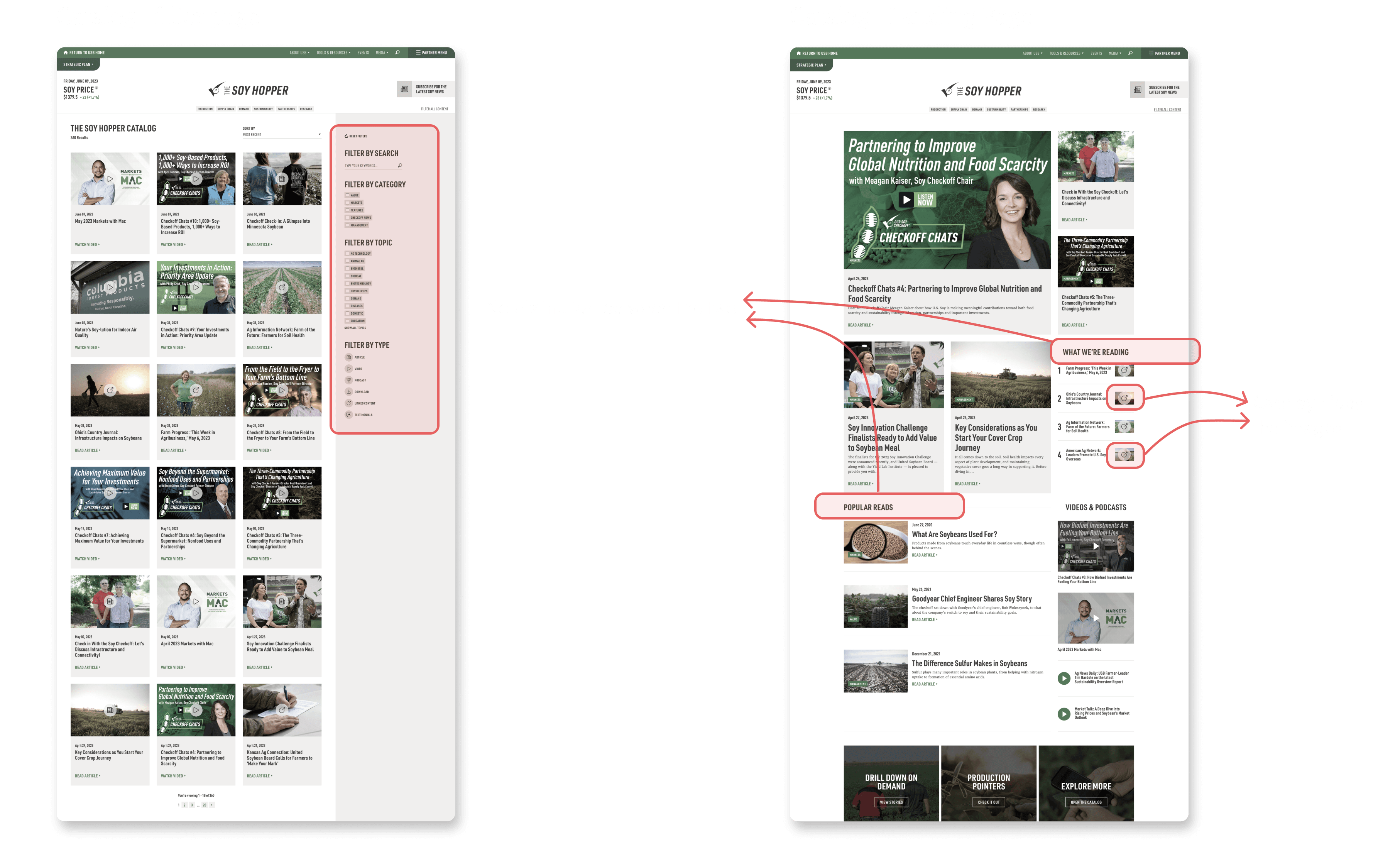
The purpose of the "What we’re reading" section is ambiguous.
The filter option leads to a visually disconnected page from the main landing page, disrupting user experience
Every article page's hero section includes price details and a ‘Newsletter’ CTA, which is unnecessary. This makes it harder for users to read, as they have to scroll past this content before they can begin reading the article.
Considering the findings, we opted to redesign the following pages: Navigation, Homepage, Soy Hopper, and Article page
Key User Pain Points
🗺️
Pain Point #1 - Navigation Difficulty
Navigation bar was a maze, with redundant buttons and crucial features hidden behind unclear, confusing labels.
🗨️
Pain Point #2 - Communication Unclear
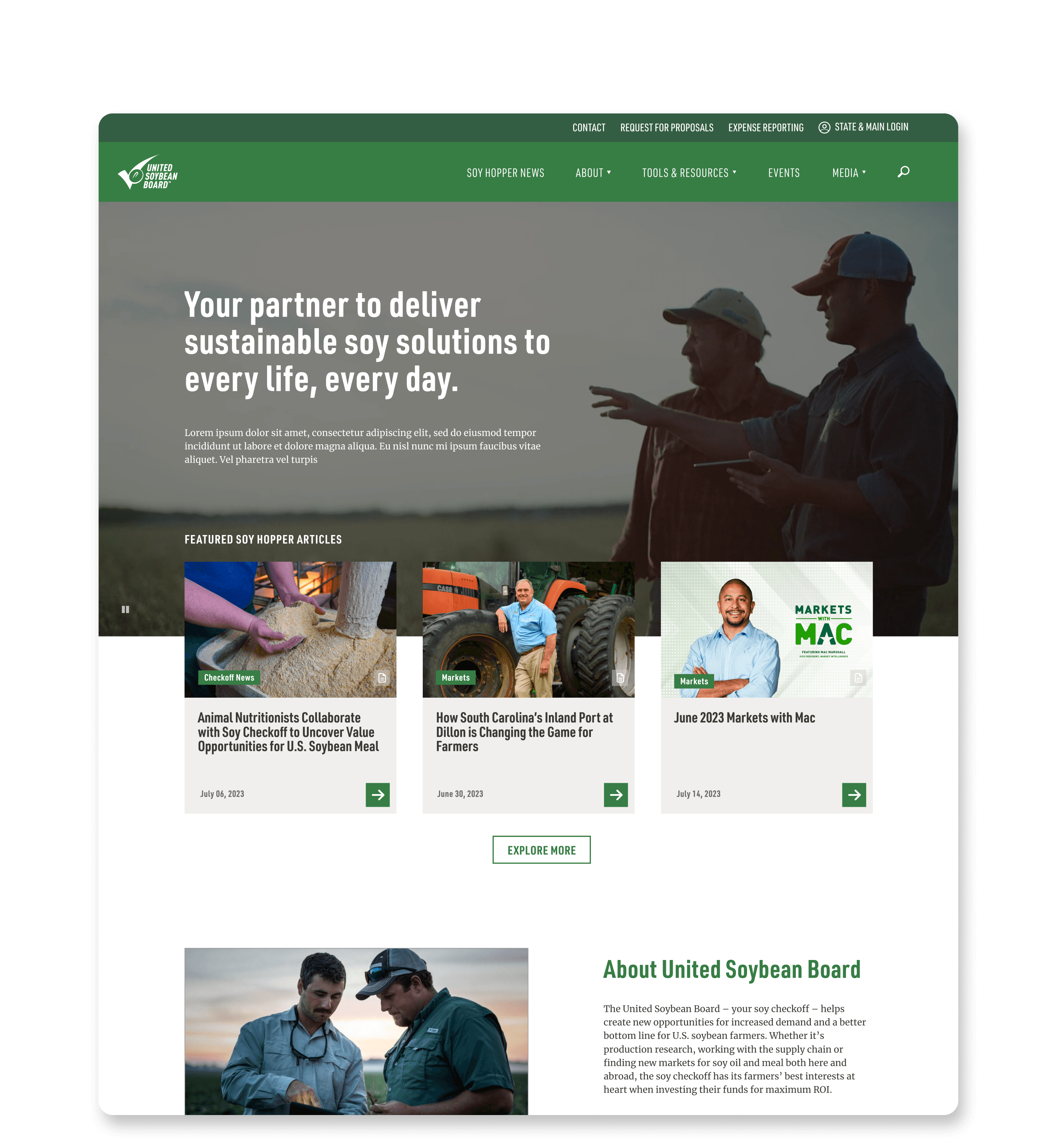
The homepage failed to clearly convey USB's mission or guide users to key resources, especially for novices.
📚
Pain Point #3 - Lost in Catalog
The Soy Hopper, meant to be a comprehensive catalog, was disjointed and hard to use, requiring back-and-forth clicks.
🔦
Pain Point #4 - Buried Information
The article pages' content was buried, making it difficult to access, and the site did not meet accessibility standards.
Seeding a New Design 🌱
Wire-frames and Iterations
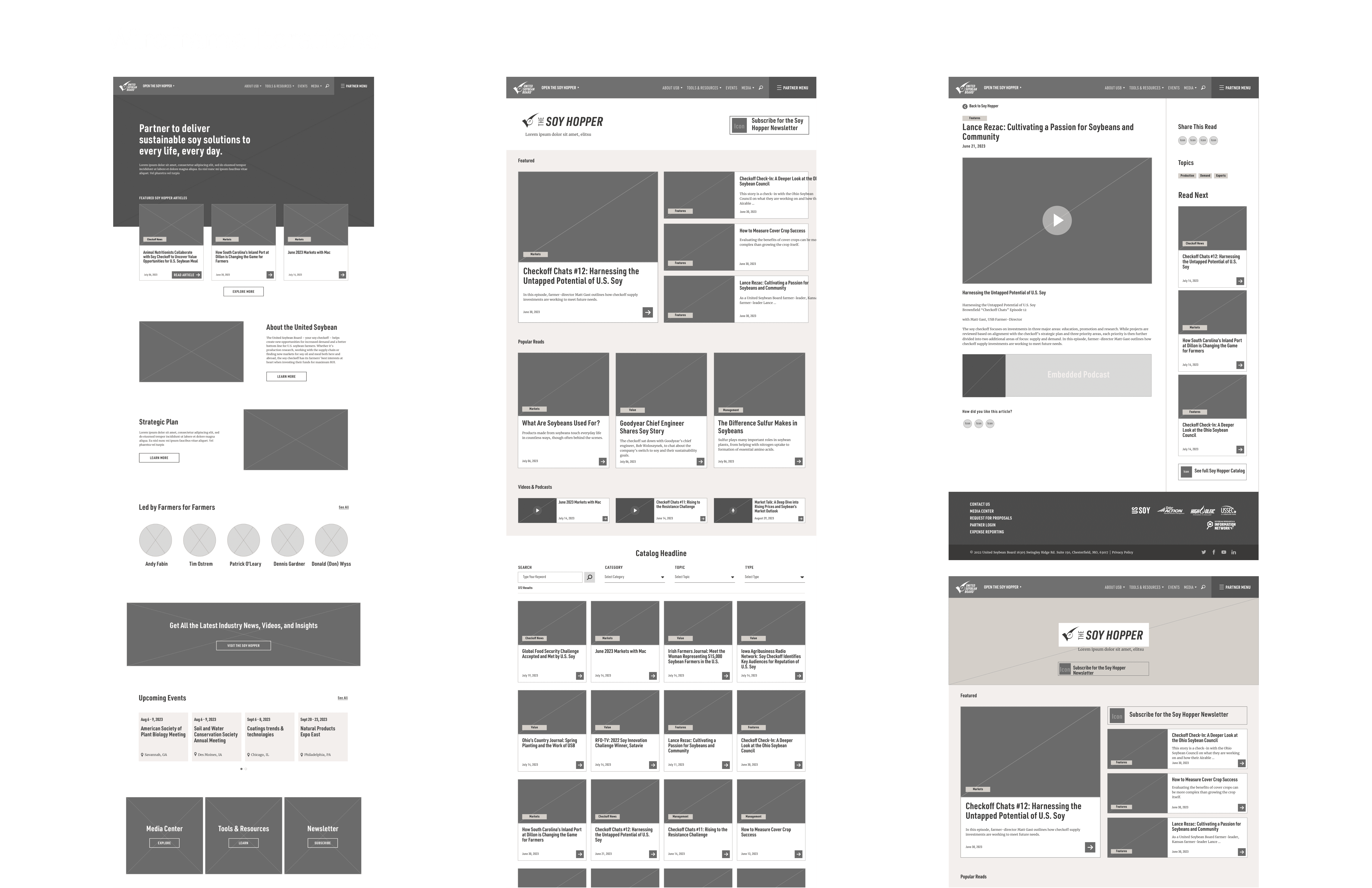
As I began tackling the challenges, I initiated the process by sketching out several potential improvements to the existing design.
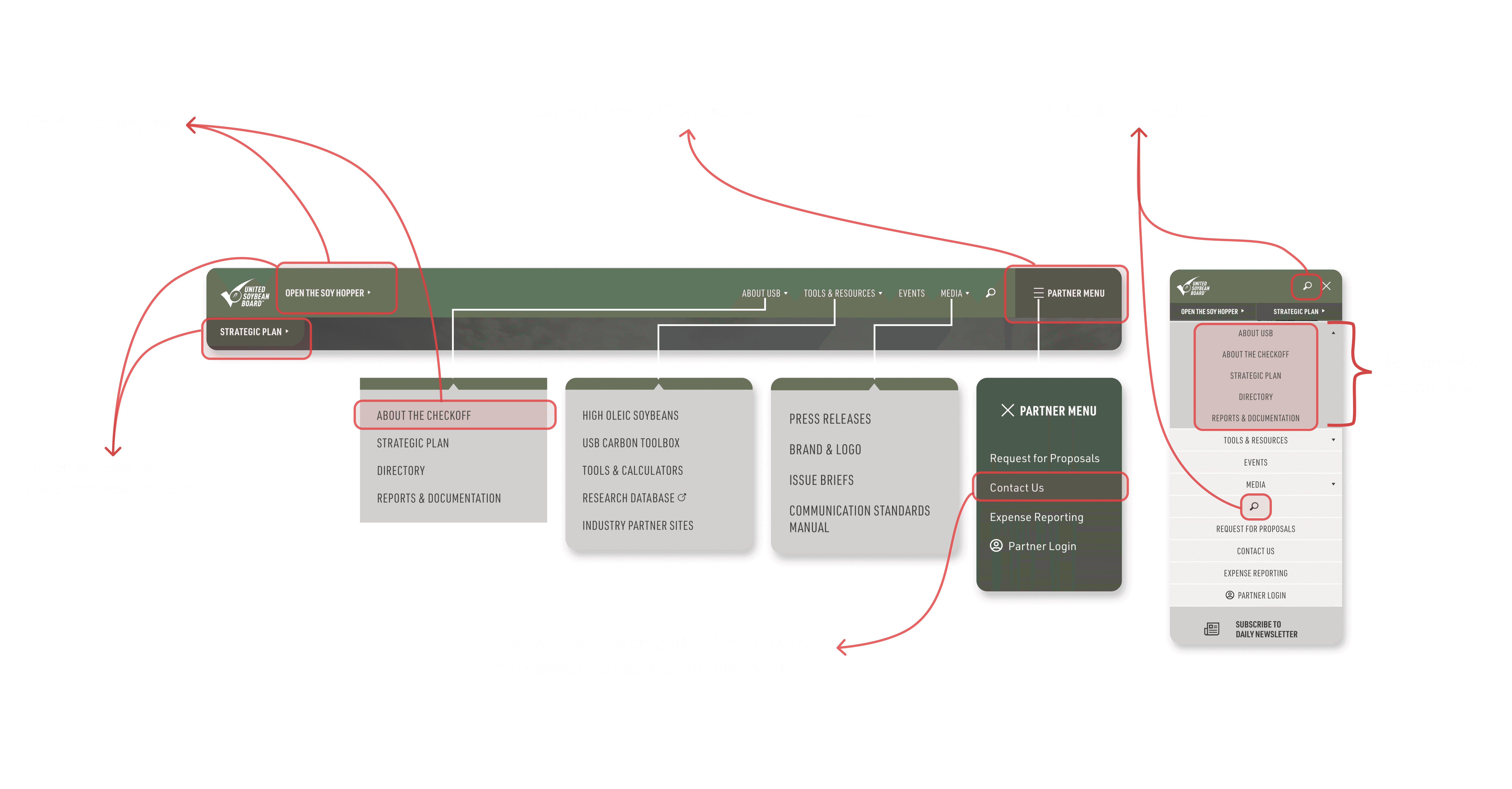
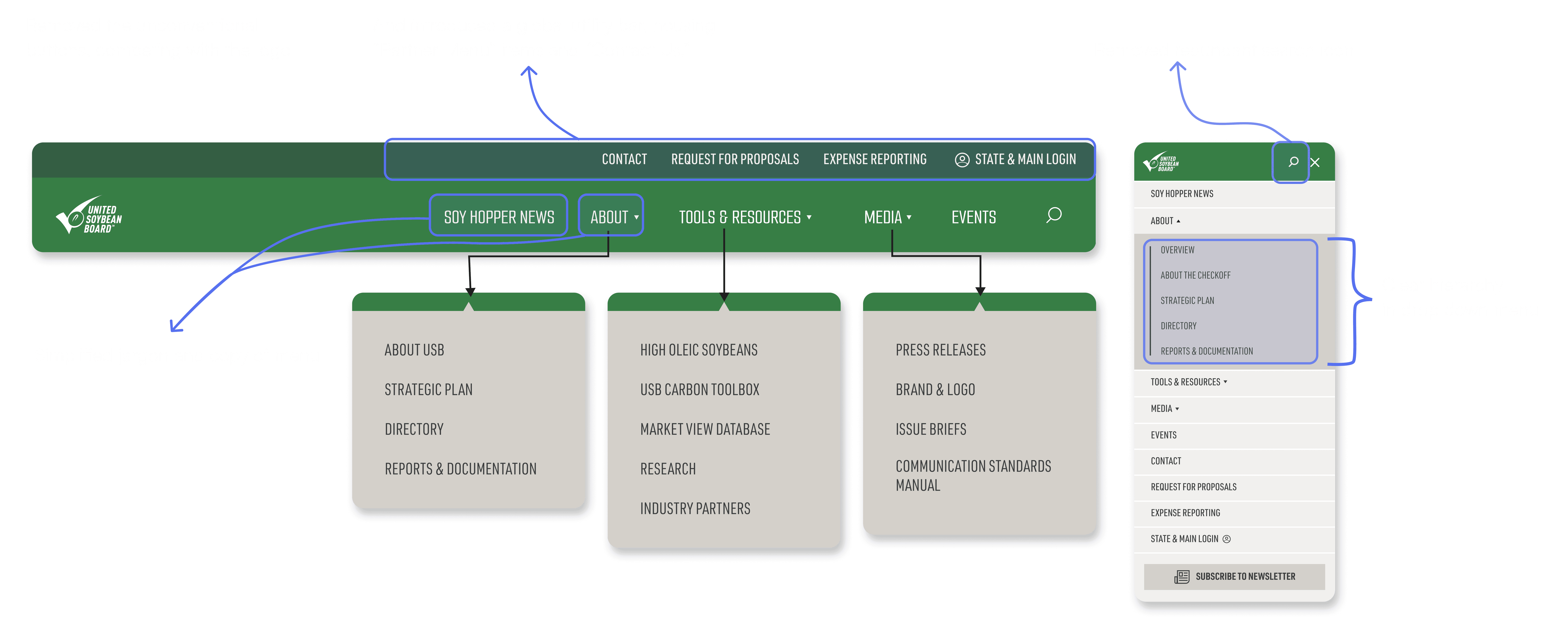
Added a global utility bar above the navigation with "Partner Menu" and "Contact Us."
Moved "Soy Hopper News" to primary navigation, removed redundant "Strategic Plan" CTA (accessible under "About").
Eliminated redundant search icon from mobile menu, restructured dropdown menu hierarchy.
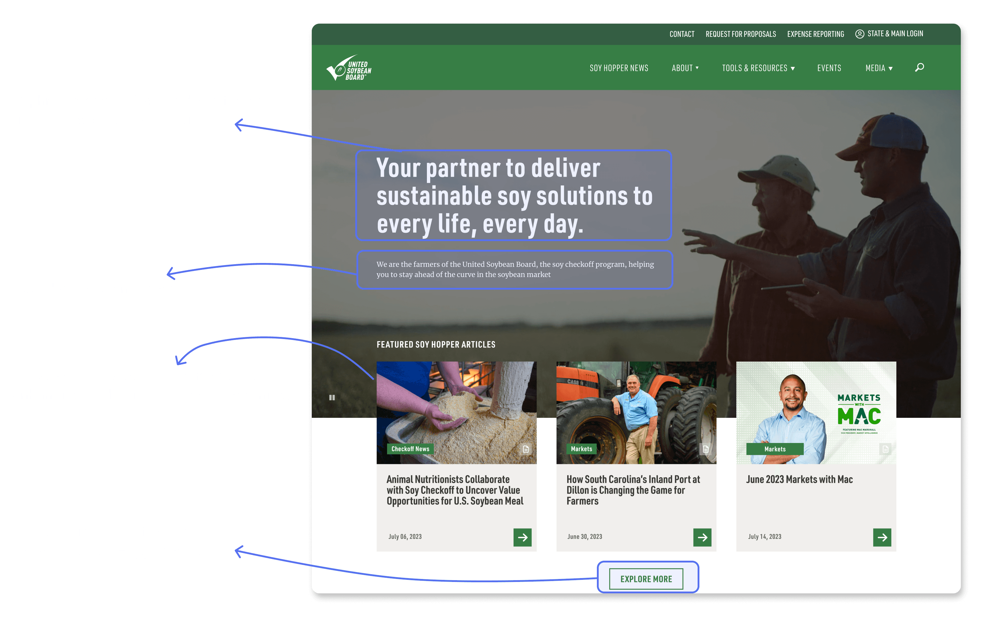
Introduced fewer cards with images and dates, enhancing readability and ease of scanning, especially on smaller screens where they are displayed as a carousel.
Implemented a prominent “Explore More” call-to-action (CTA) that redirects users to the Soy Hopper catalog, encouraging them to explore a broader range of articles.
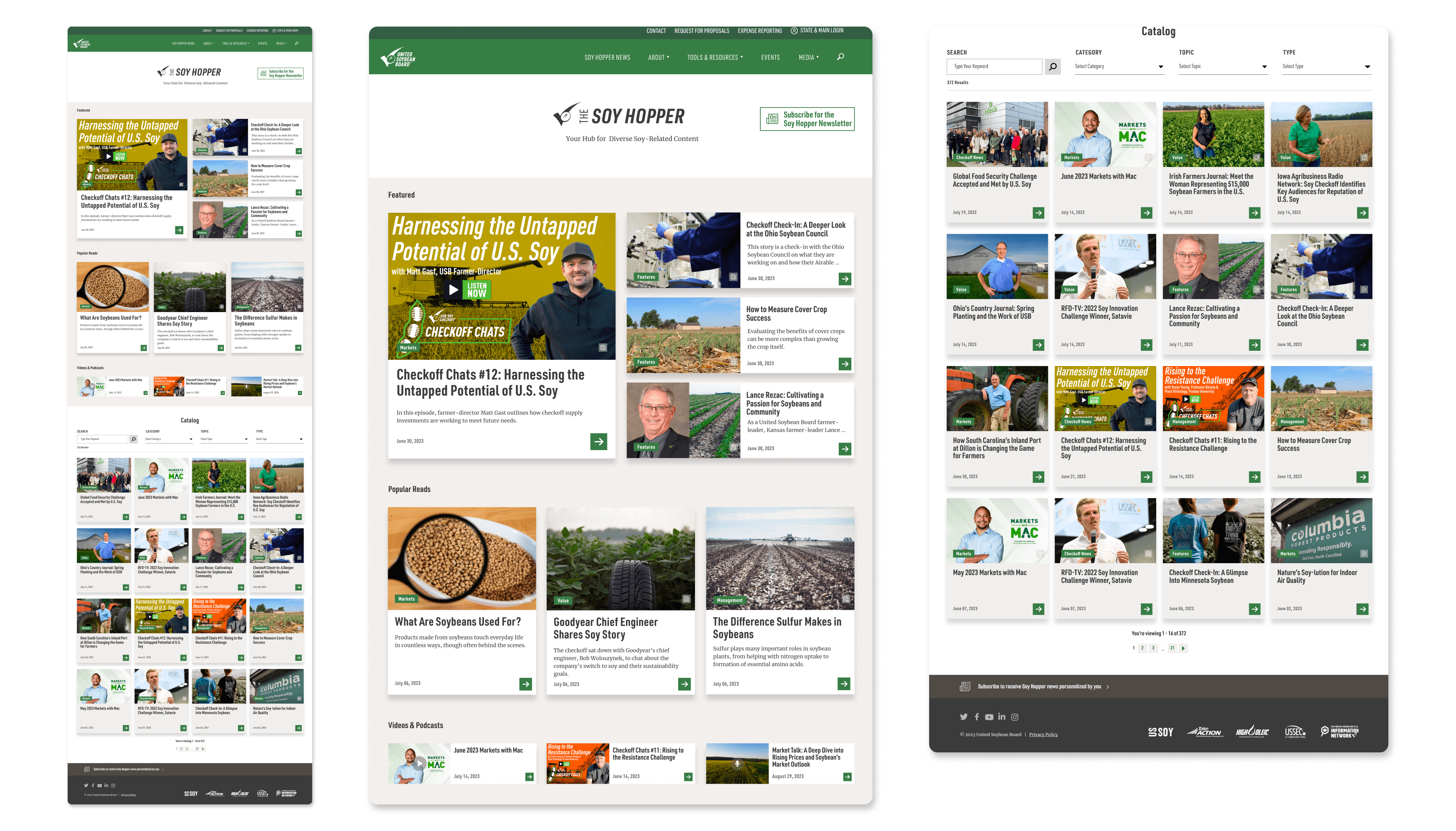
Removed the underutilized and outdated price section and introduced a descriptive tagline below the Soy Hopper logo to convey the purpose clearly.
Renamed "What we’re reading" section to "Featured" for clarity.
Integrated the filter page with the landing page and implemented dropdown filters to enhance user flow.
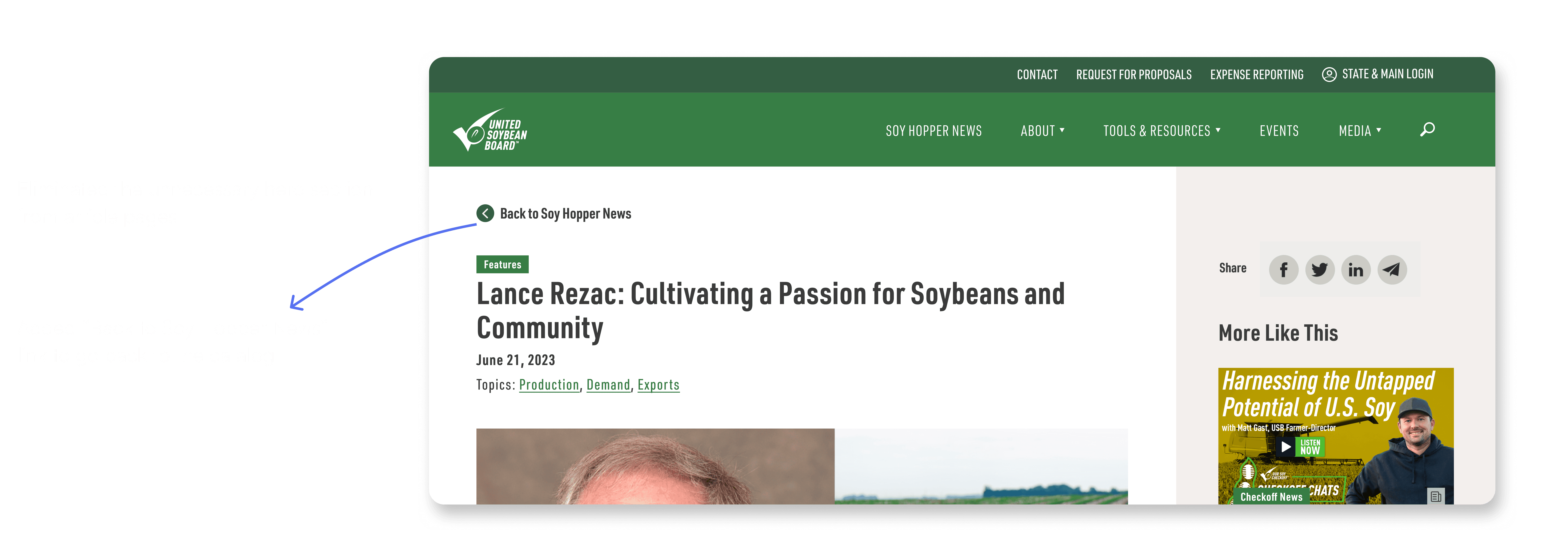
Eliminated the hero section and kept the article right on top, so the users do not have to scroll down. Also, added “Back to Soy Hopper News” link to go back to the catalog.
There were numerous other discoveries and recommendations, including aspects related to performance and accessibility. However, these aspects fall outside the scope of this case study. If you have an interest in exploring these in-depth, you can refer to the detailed presentation available here. (Link)
That’s all for now, folks! Hope you enjoyed this case study.
Impact 🎯
From 4 user tests and stakeholder meetings, here are the 3 key impacts:
Increase in
Task Completion
